Home improvement
People who have been following me for a while know that we live in a composite house. 2 town houses below and above. We have always kept these homes separate in their original form, and used the rooms as they always have been.
In practice, that meant that we had bedrooms both upstairs and downstairs. Among which 2 bedrooms adjacent to the kitchen.
In the long run we thought it was not ideal that the children's rooms were downstairs near the kitchen. You should always be quiet at night when the kids are sleeping.
We also needed a bigger living room.
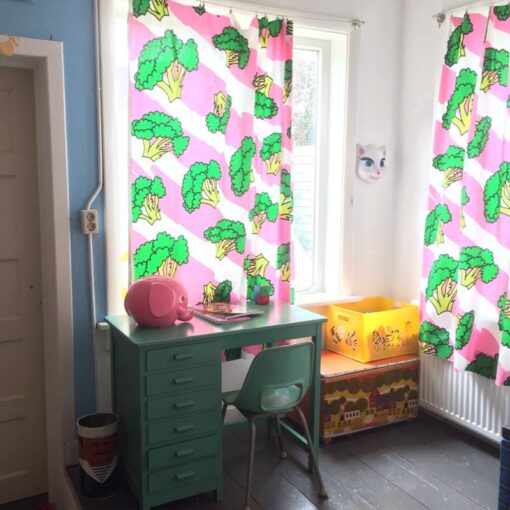
Living downstairs, sleeping upstairs, that was the plan!
Break away stairs
Such an extra piece of living room is of course very nice. But the downstairs room that we wanted to add to the living room was not very big. Some space was lost in this room because of the stairs in it. Actually superfluous, because we already have a large staircase in the hall at the entrance of the house.
We decided to break down the stairs!
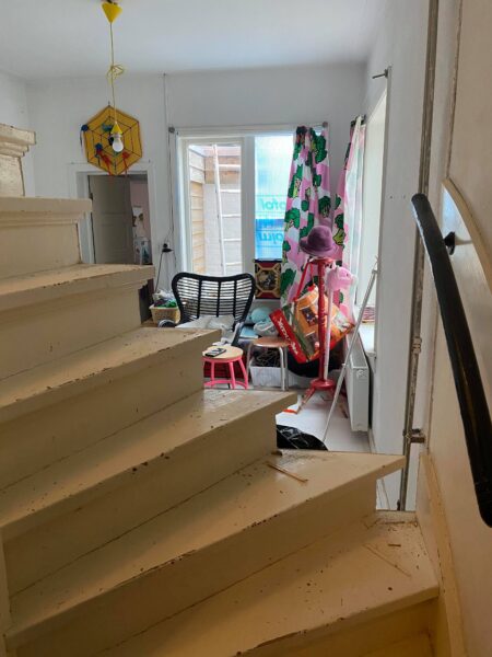
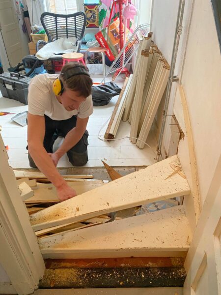
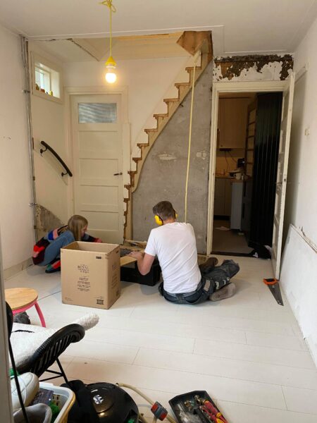
You don't even realize how much space a staircase takes up. The room immediately became a lot bigger. We closed the door on the right. Two openings to 1 space is superfluous.
‘
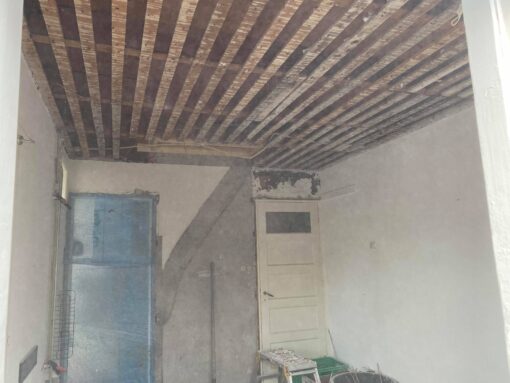
The ceiling has also been replaced immediately. Earlier in the year 30 did they put straw in the ceiling as an insulation means. Today we have other resources for this that are also more fire-safe. Quite an operation which involves a lot of dust as you can see!
Vloer
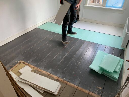
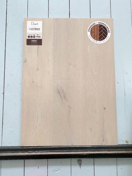
The floor was gray when we bought the house. We laid white IKEA laminate over this at the time. But because the space had to become a unit with the living room, we wanted a new floor that would continue with the living room floor. We chose a PVC floor with a soft whitewash.
We have removed the thresholds so that the new floor continues all the way to the other living room. This way you create even more unity.
Walls plastered
And as soon as the walls are plastered, you can immediately see what the space will look like.
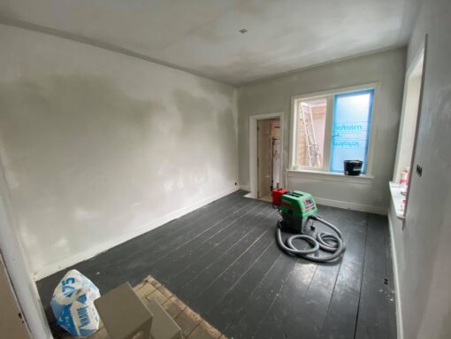
The space is ready for the new floor, a wallpaper and a lick of paint!
A lovely place
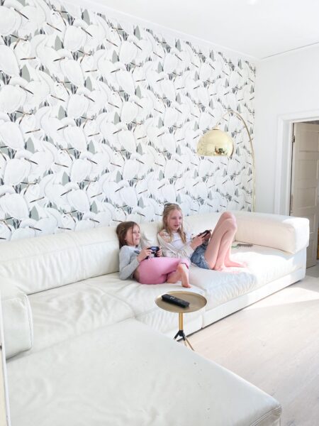
On marktplaats I found a fantastic leather design sofa. I actually don't like leather sofas much at all. But I found this huge element sofa so perfect for this place, that I've set my principles aside!
Plus I also loved the idea that leather is not so stain sensitive. What if you have children is a big advantage!
I bought the crane wallpaper at the Hornbach. Low budget, I was in total for 3 rolls lost €60. The soft green-grey shade matches the floor perfectly.
For the walls I chose a white wall paint radiant white. This to keep the space as spacious as possible. I want to create the color contrast with the accessories. This way you can alternate with color again.
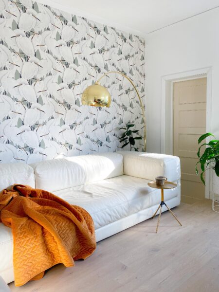
The room is ready for use. Although the room is not quite ready yet! I still have to pick out the window coverings, and there will be a corner with a chair!
But everything in its time, an interior can grow quietly is my motto!




Leave a Reply